Owen + Alchemy
A fashion industry vet had a vision: take the same simple chic aesthetic and bring it to life in a ‘juice apothecary.’
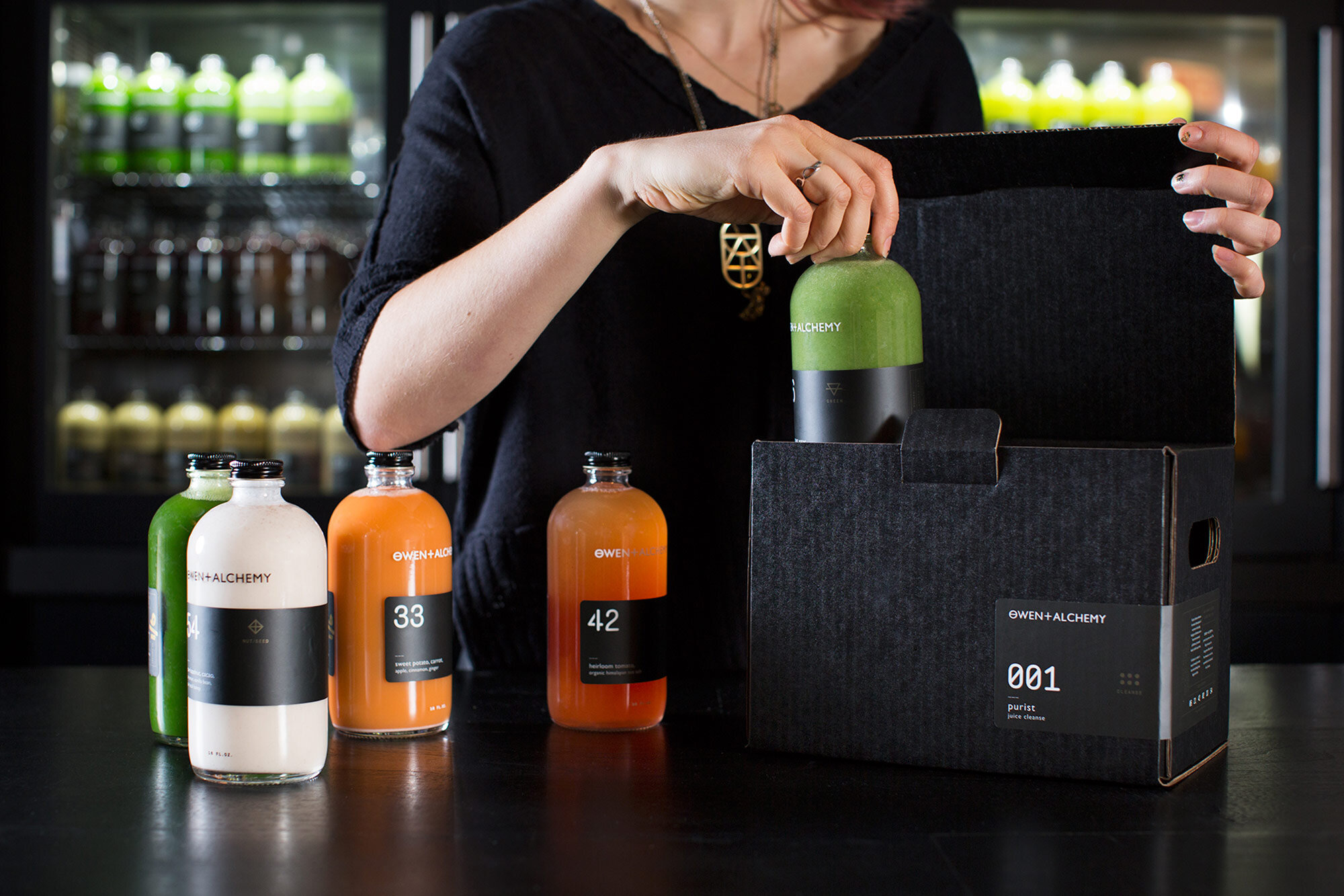
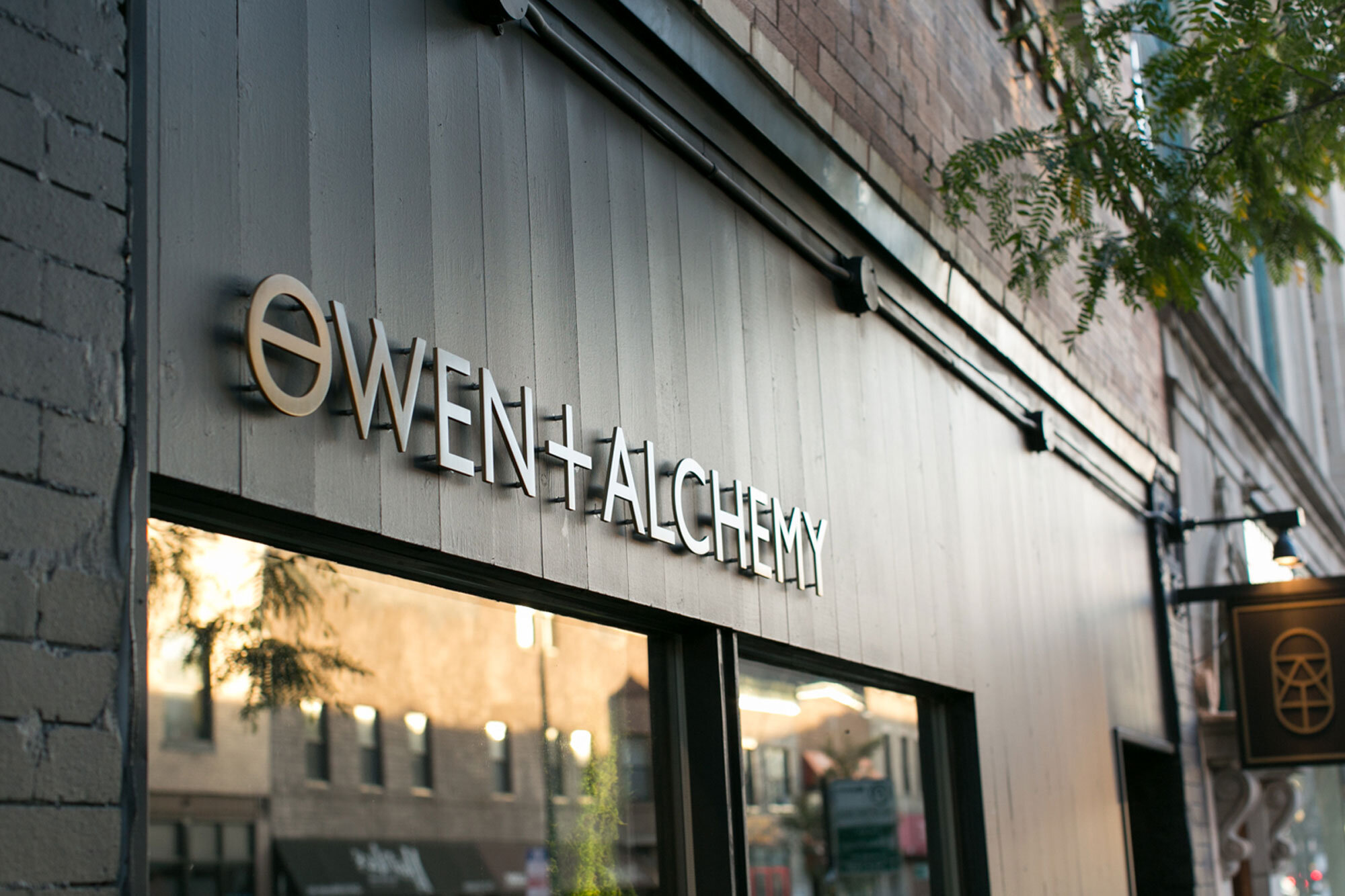
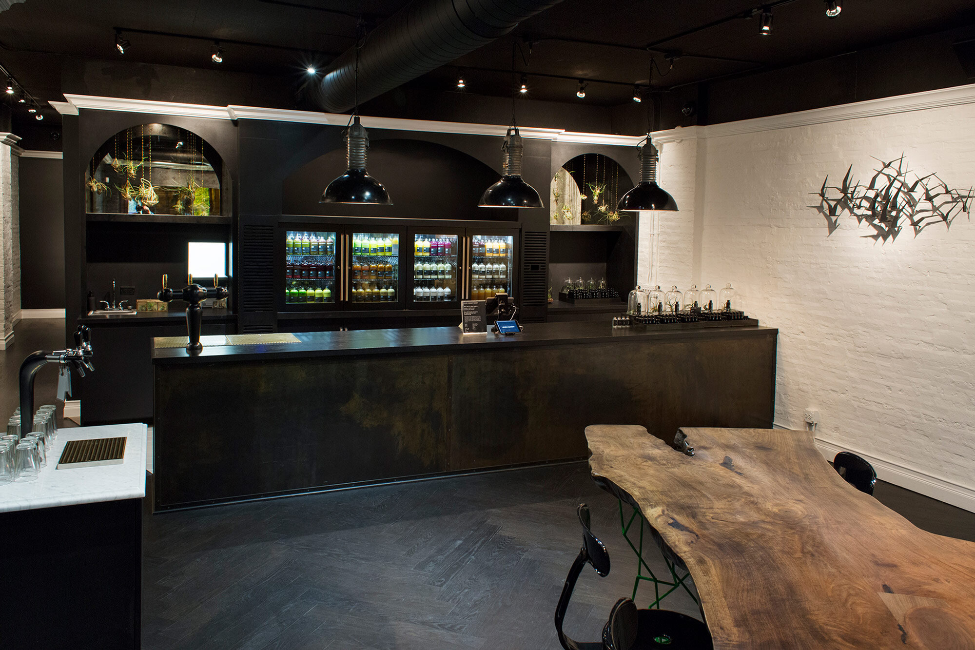
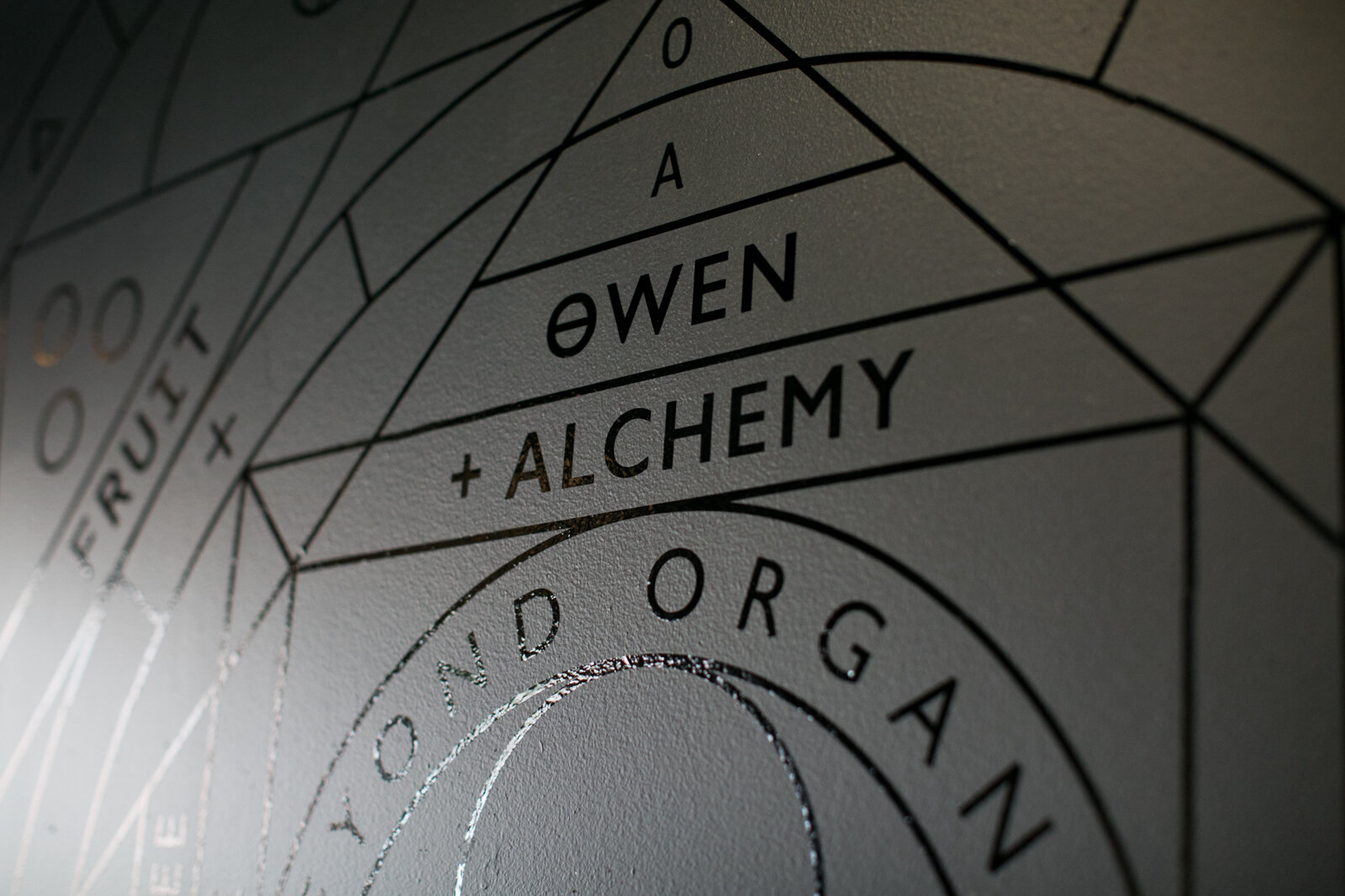
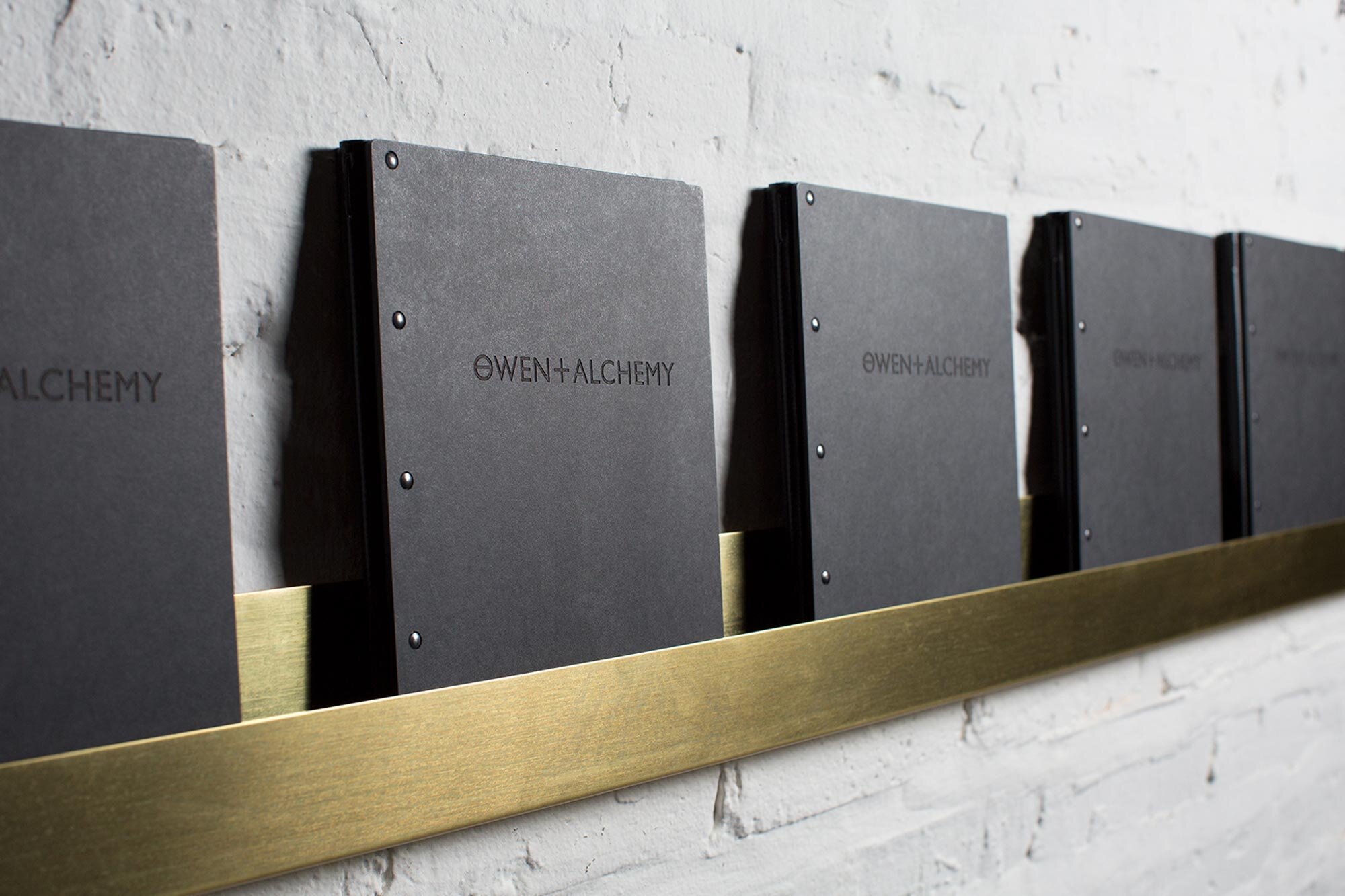
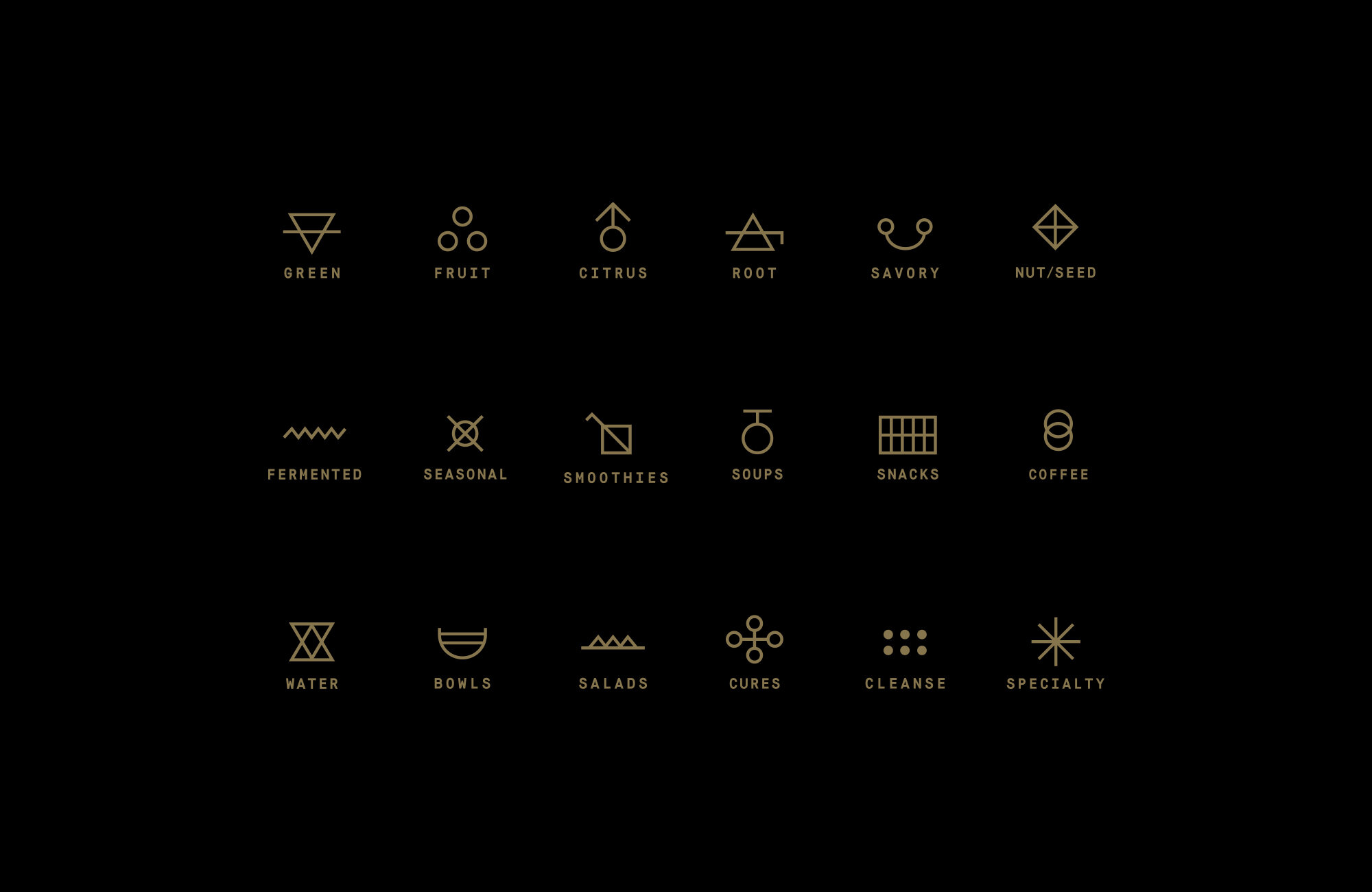
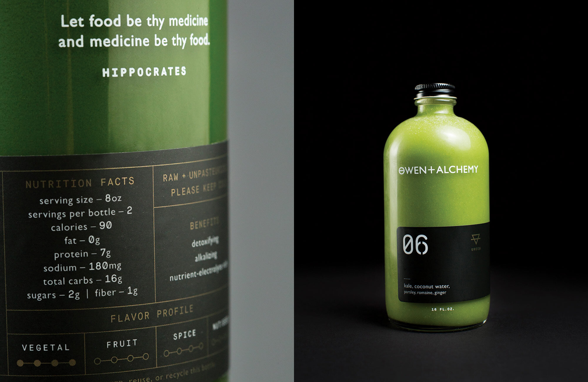
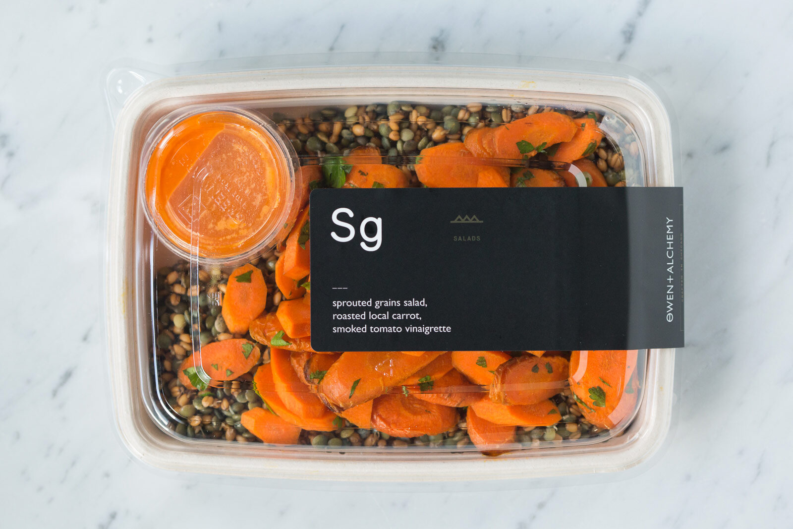
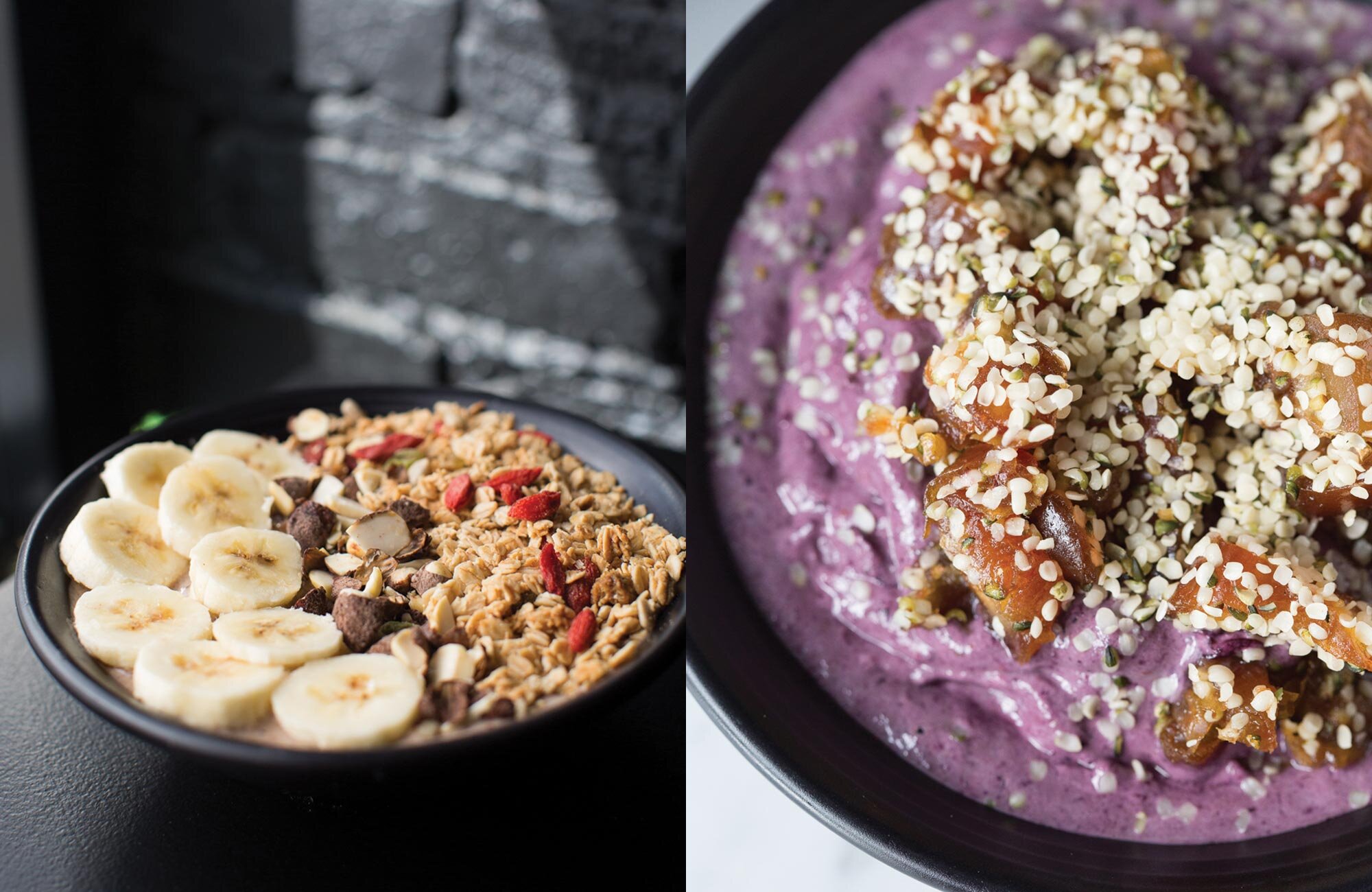
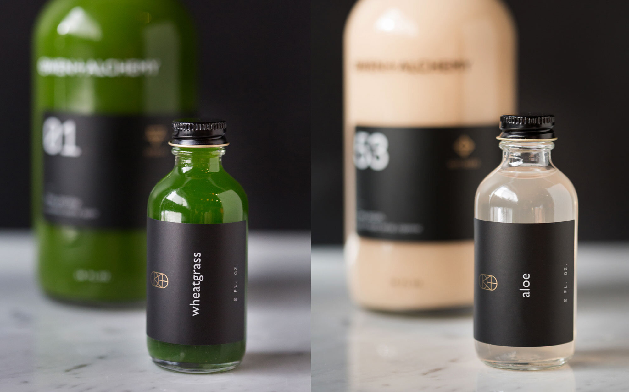
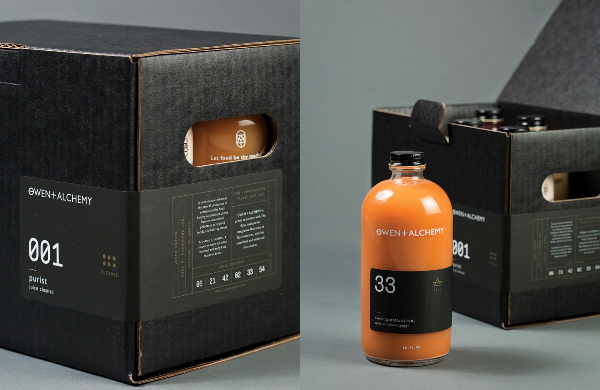
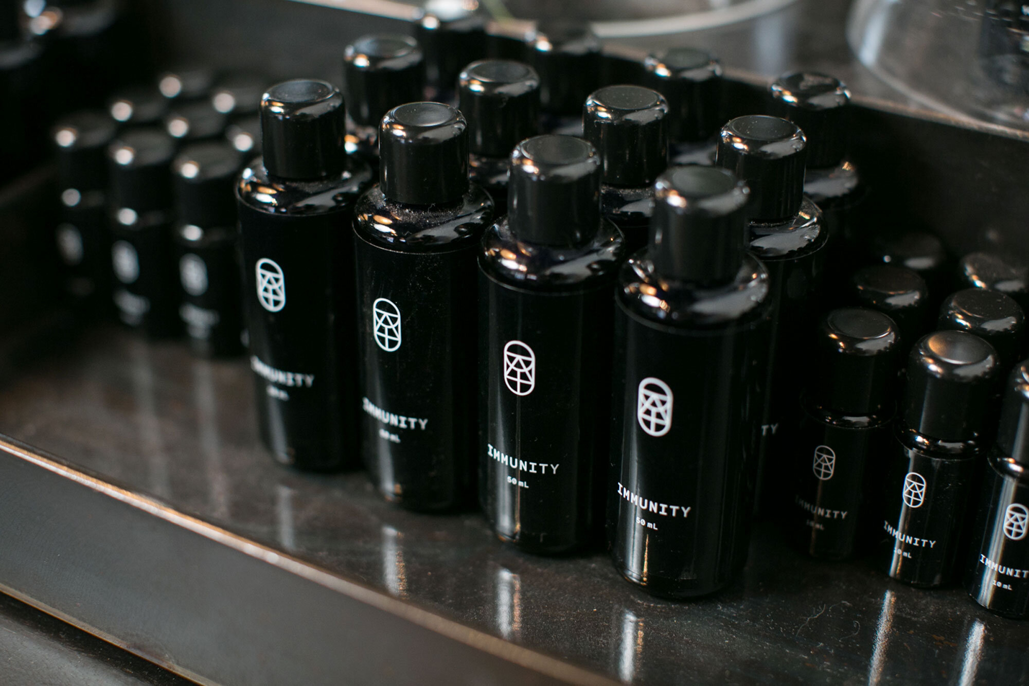
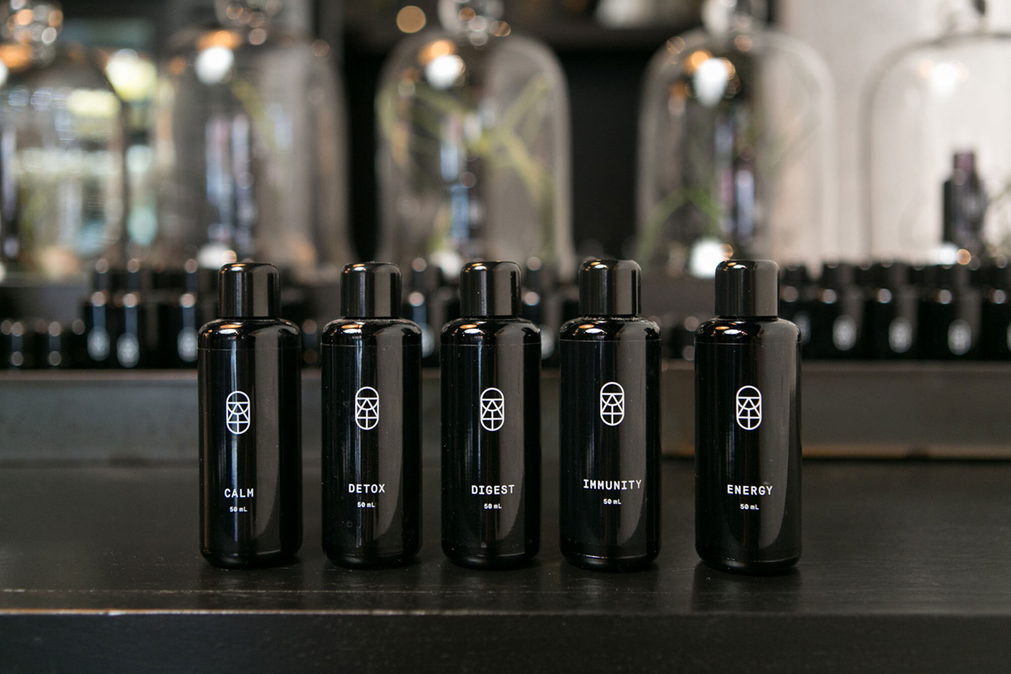
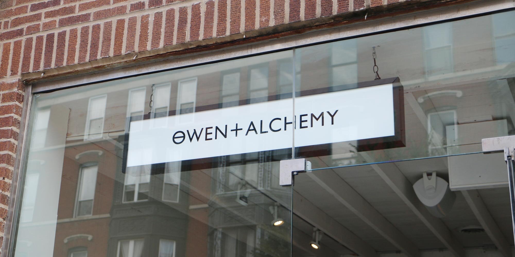
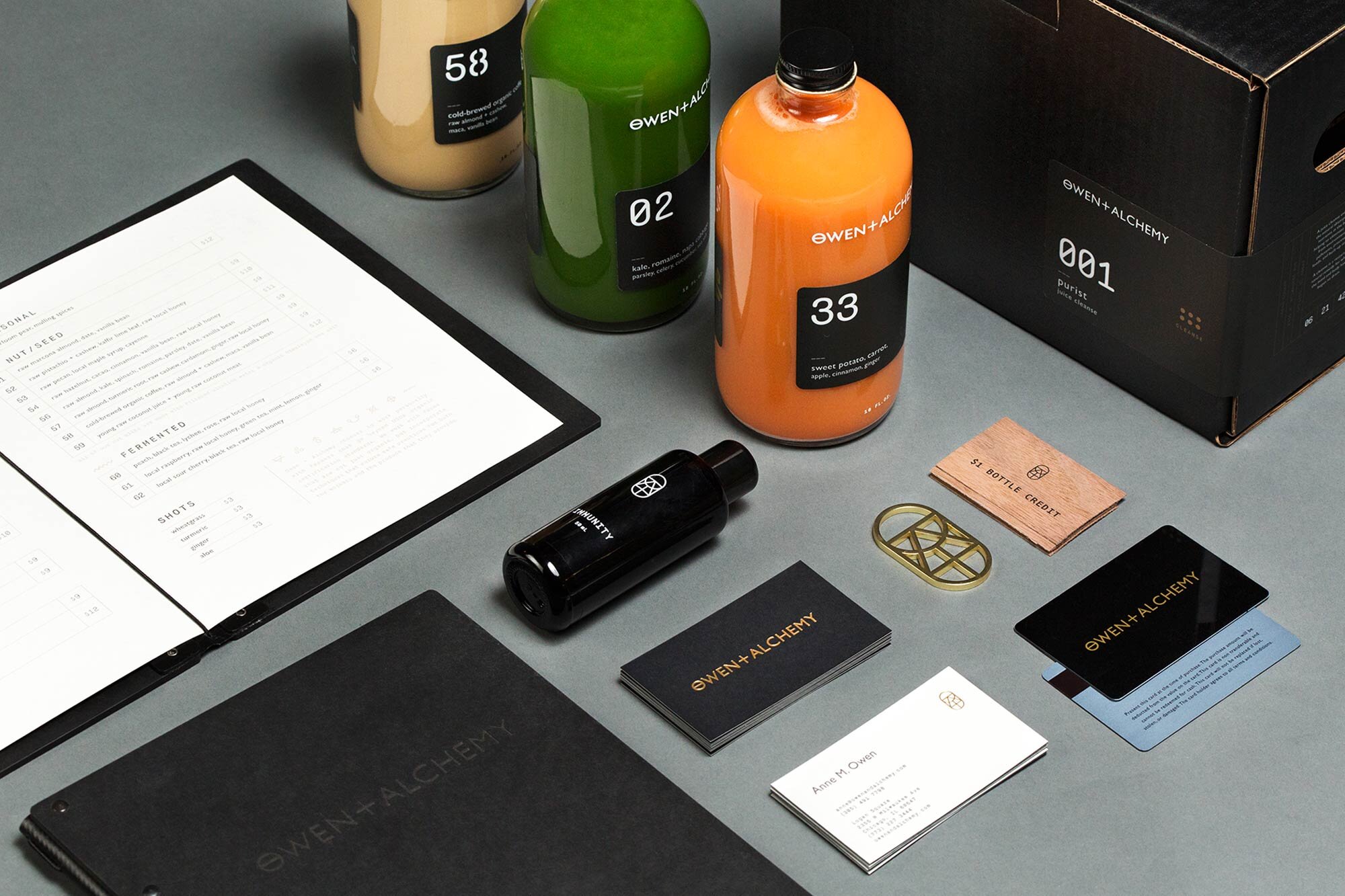
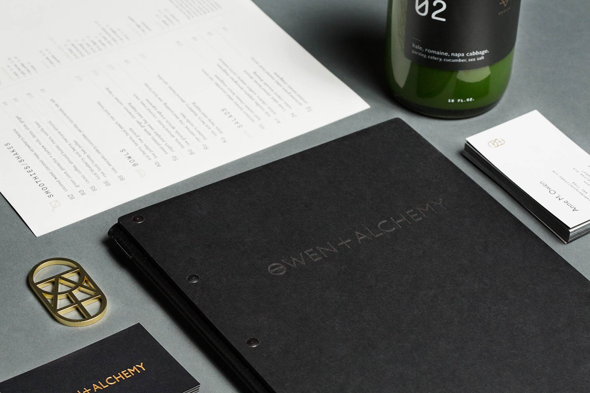
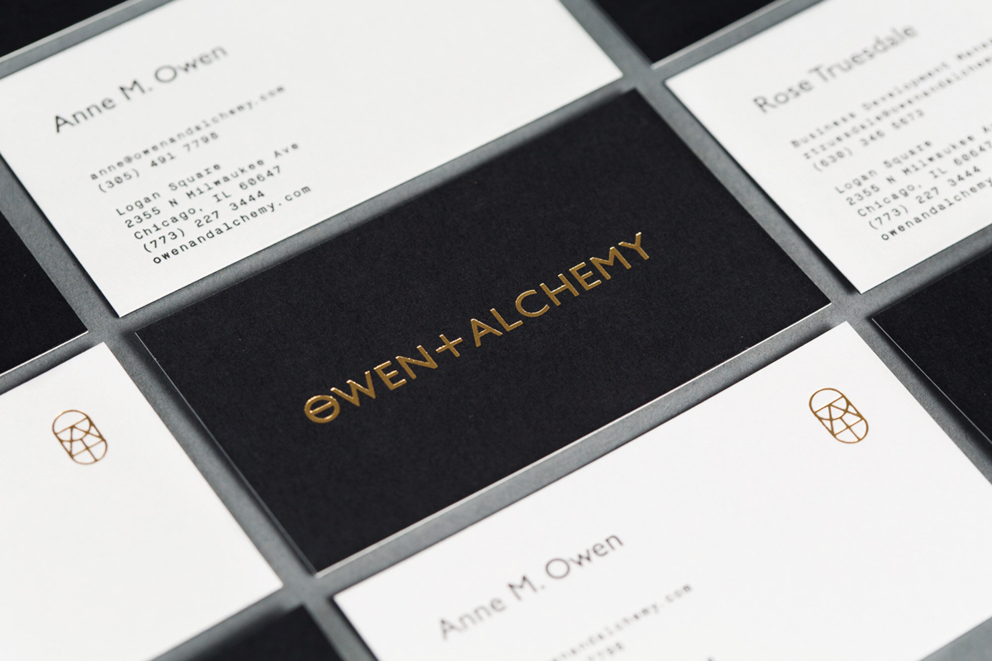
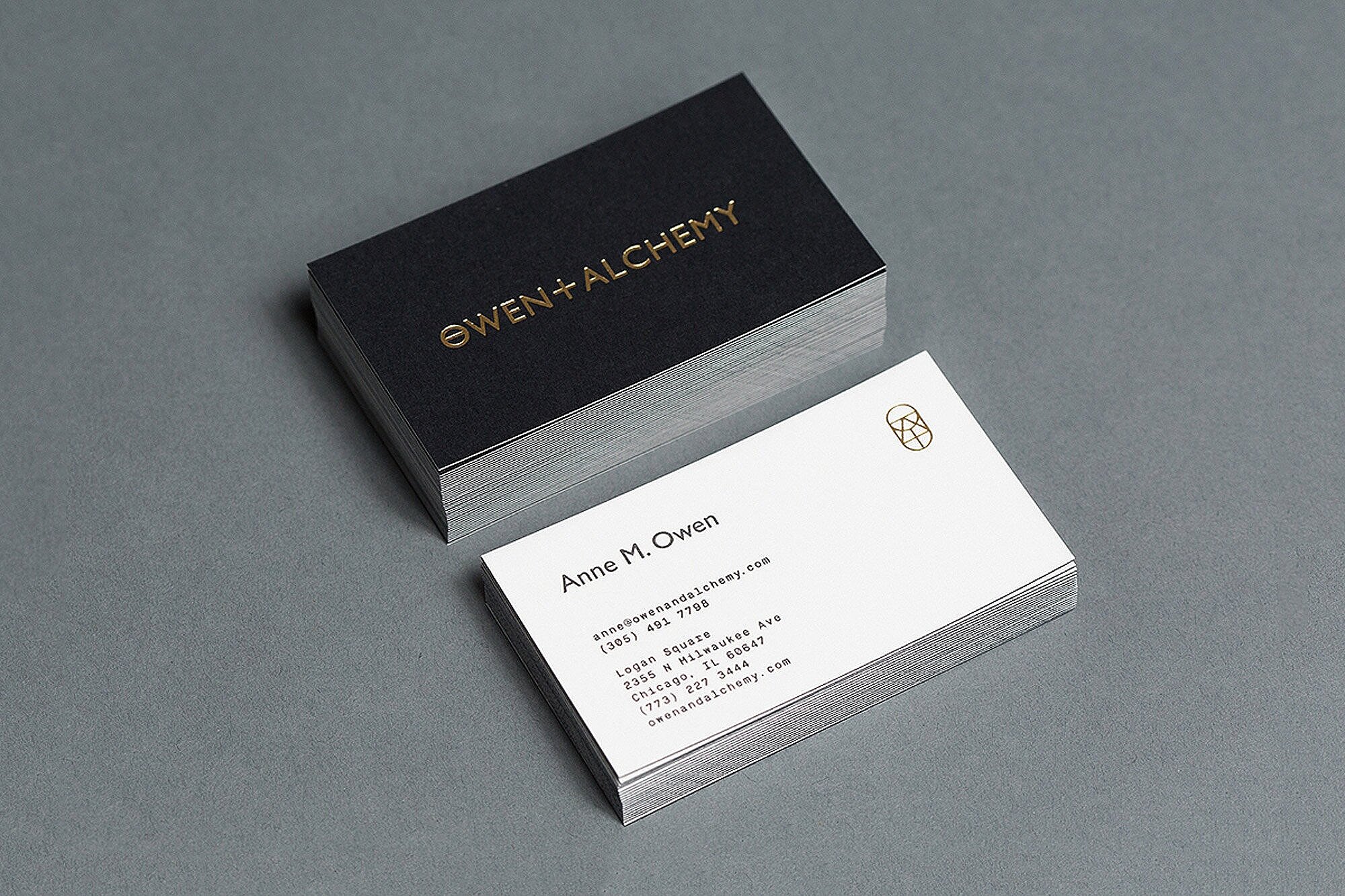
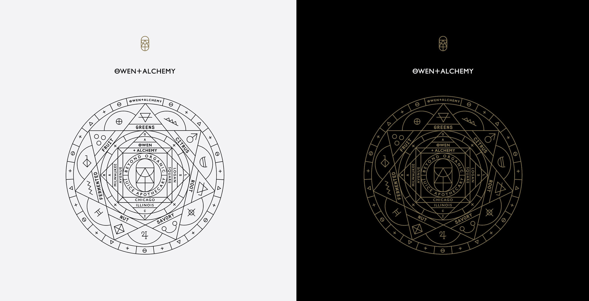
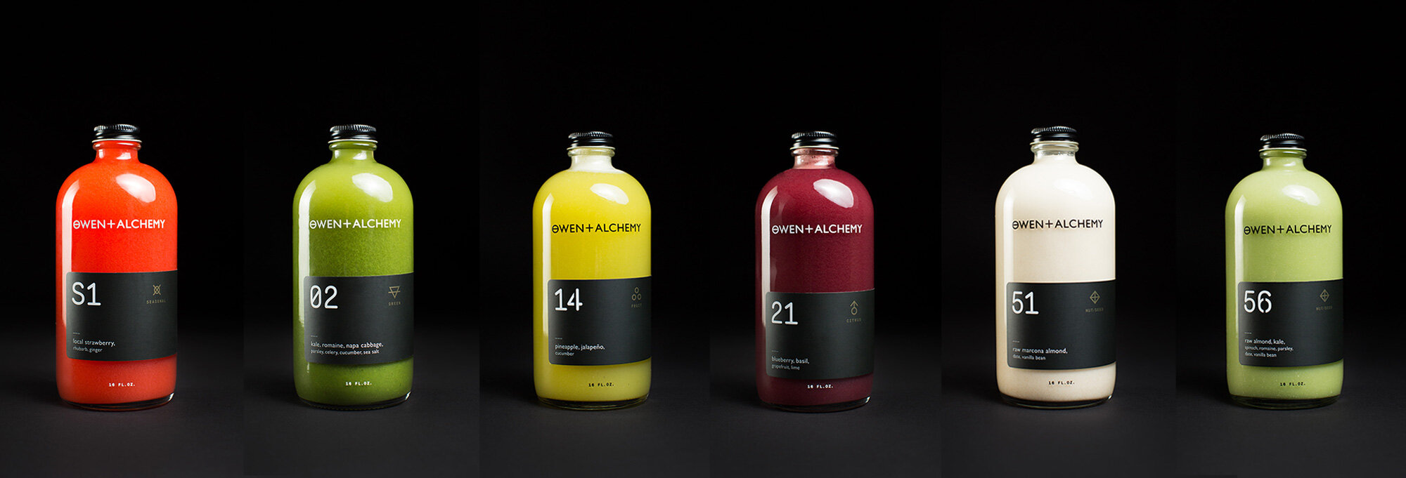
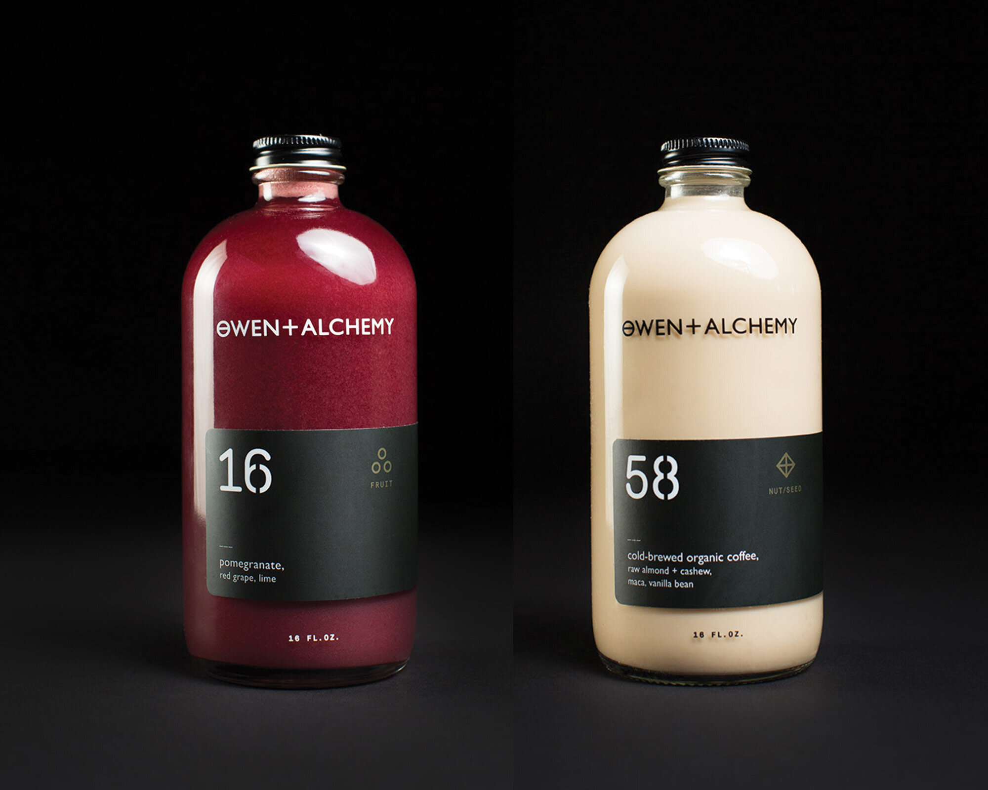
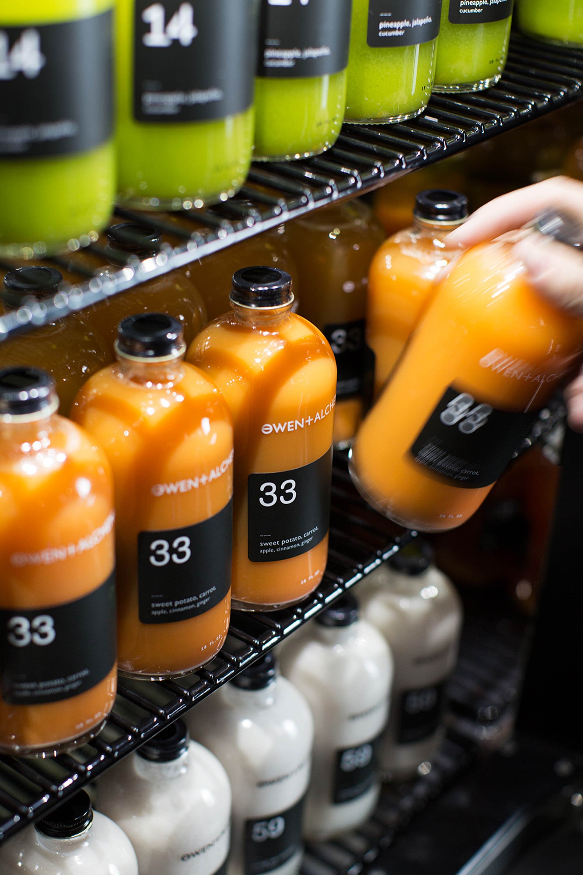
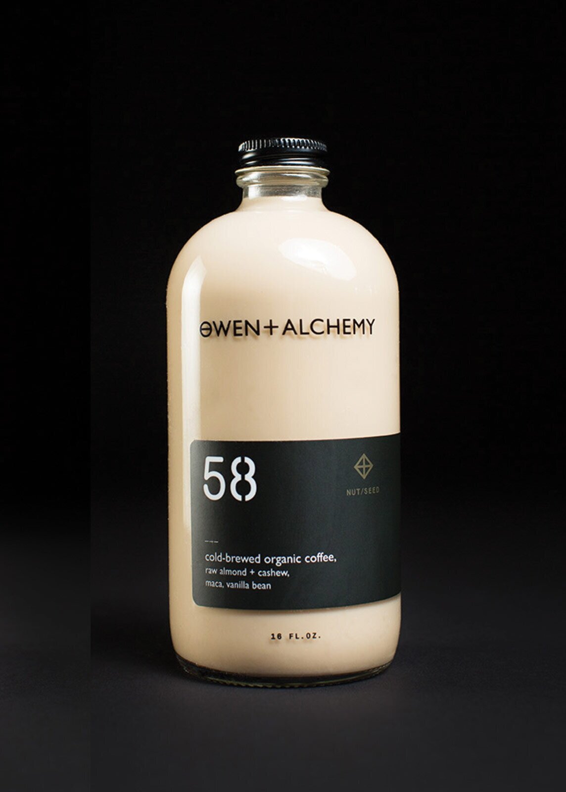
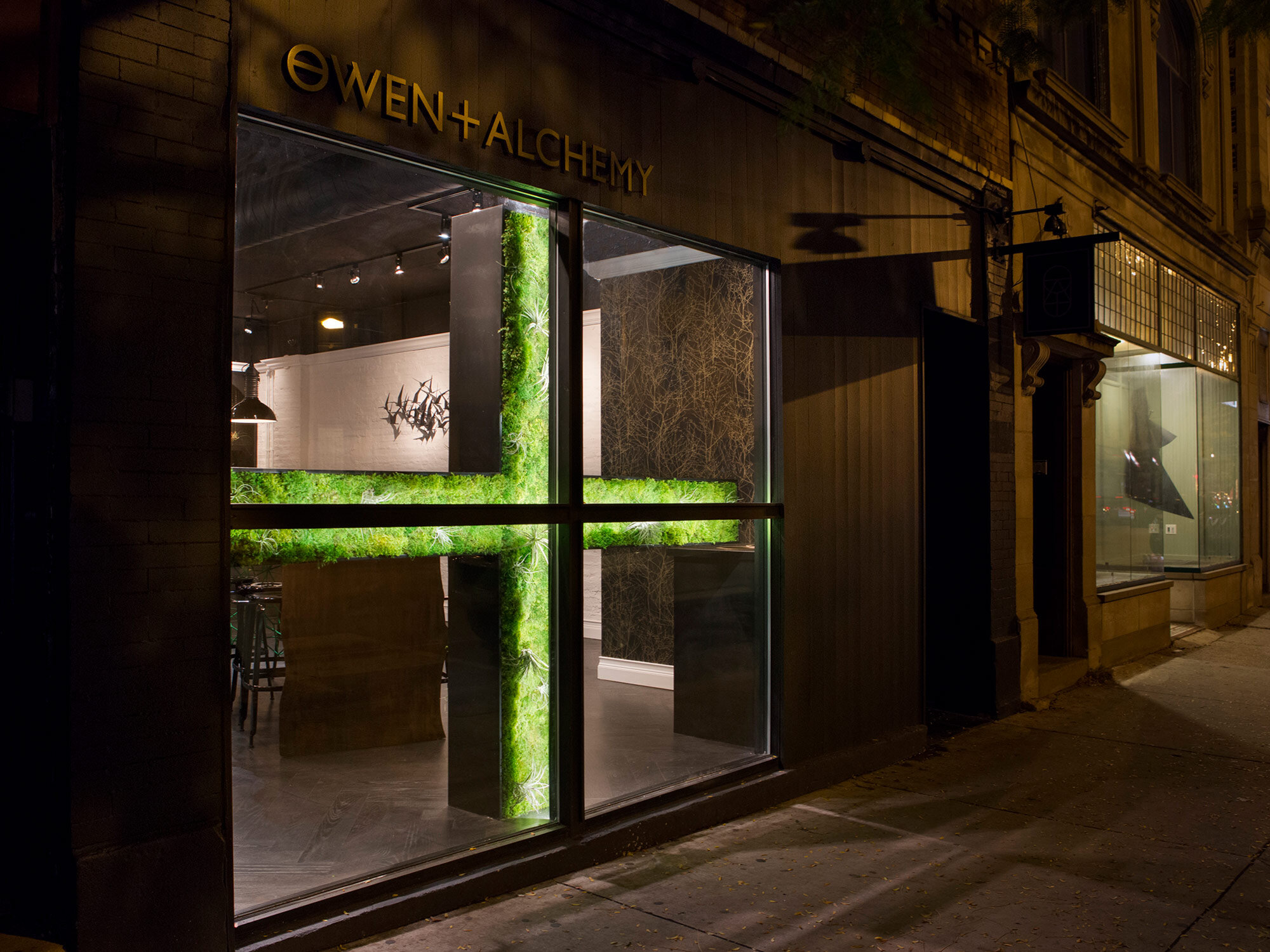
To do this, founder Anne Owen chose Chicago's Logan Square to set up shop, and leaned on the creativity of the area to fuel her idea. We worked alongside Owen, in collaboration with Potluck Creative, to brand the shop from the ground up. This included designing the identity, packaging, signage and collateral, along with the storefront’s exterior and interior design. We worked to play up the scientific aspects of alchemy by creating a series of symbols to represent each class of beverage, to pair with the sleek packaging effort. O+A opened to critical acclaim in 2014, and went on to open two more shops, including one inside downtown Chicago's Eataly.
↗ VISUAL IDENTITY ↗ ILLUSTRATION ↗ COLLATERAL ↗ SIGNAGE ↗ PACKAGING
The brand was inspired by old alchemic symbology in tandem with the herbal, healing infusions each cold-pressed juice had to offer. We mirrored this concept by creating minimalist packaging to juxtapose the vibrant colors of the product.


Credits
Sam Jorden/Potluck Creative, Creative Direction
Mikey Litchfield/Potluck Creative, Photography
Right Way Signs, Installation
Recognition
Takeaway Food Packaging Now, 2017
PRINT Regional Design Annual, 2016
HOW Design, 2016
LogoLounge 9, 2016
The Dieline, 2015
Lovely Package, 2015
Gold, World Beverage Design Competition, 2015